What is Kagi Chart?
Tuesday, 18 July 2017 02:22
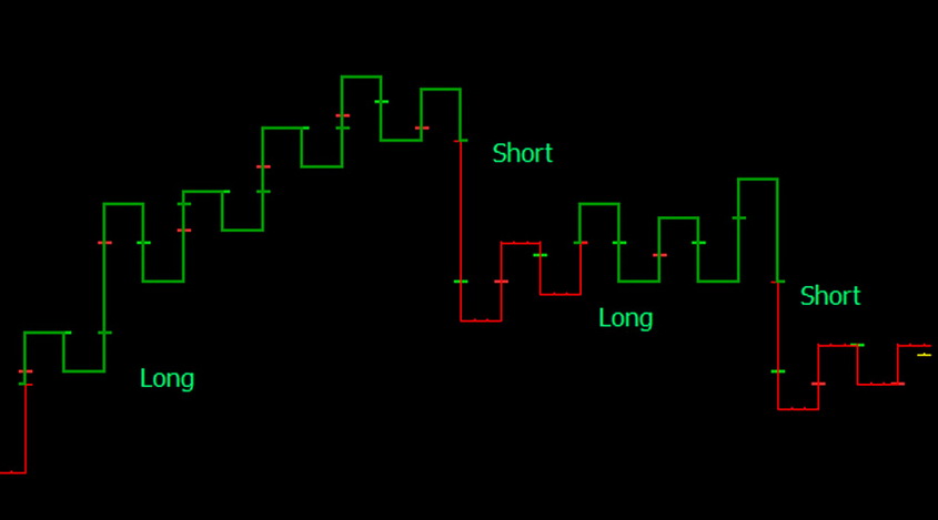
The Kagi chart is a method of displaying the price dynamics. It was born in Japan, in the 70’s of the XIX century. The name of this type of chart comes from a Japanese wooden tool used in a typographic production, which had a similar, curved shape. With the help of such tools, traders fixed prices on the rice exchange. This method came to the West much later, only at the end of the XX century.
Principles of Construction
This method is completely different from candles or bars. Constructing a graph on this principle, a time is completely ignored. The price movement isn’t divided into the time intervals, but is displayed only as a growth or decline.

- Within an increase in the value of the asset, a vertical line is drawn from the bottom to top.
- Within a downward correction, the graph stops for a while.
- If the rollback of the price was weak and didn’t go beyond the allowable range, the line will be further drawn upwards, following a new increase in value.
- If the rollback was significant, it means a trend reversal. In this case, a short horizontal segment is displayed, after which a vertical line is drawn from top to bottom.
It’s worth paying special attention to the price, depending on which the acceptable level of rollbacks is determined. This value is set by the trader, and to choose it, it’s necessary to understand the features of a used currency pair. This value determines the correction or change of the trend. For example, this value can be equal to 20 pips. In this case, only fluctuations of 21 or more pips will be considered the trend reversal.
At the same time, if correction doesn’t reach the level of 20 pips, it’s useless to try fixing profits, as the probability of the trend reversal is quite high.
These calculations can be carried out automatically, using special indicators. These tools are not built in the MetaTrader4 platform, but they can be installed manually. For example, there is KAGI indicator, which is displayed as a separate chart.
Application of the Indicator

Installing the KAGI indicator, you can configure some basic parameters. However, it’s worth noting that this chart won’t give any special, super-profitable signals. It just reflects the price fluctuations in a new, more convenient form.
So, it’s possible to configure the following parameters of the indicator:
- Prog is the parameter that serves for the assessment of the price fluctuations. The indicator line will turn in the opposite direction from this mark. The value is set as a percentage.
- Procent - this parameter can be equal to true or false, and is responsible for activating the percentage module. If the value is false, the program will be guided by the Size parameter.
- Size - the same parameter, represented in pips. This method of Kagi calculating is a classical one.
The percentage parameter is more convenient, since in this case your scheme will be more stable in conditions of changing market volatility. Setting such a parameter in pips, the graph may be easier to perceive.
The percentage deviation is also more convenient comparing the dynamics of several currency pairs. For example, with a value of 20 pips, you can easily trade a EUR/USD pair. However, for the GBP/JPY pair such settings will cause a lot of extra noise.
Signals
It’s easy to see that the tool displays the lines of two types, thin and thick ones. Thick lines are called Yang, and thin lines are Yin. These lines form the shoulders (horizontal segments before the bearish reversal), and the waists (the areas of the bullish reversal).
In the Kagi system, shoulders and waists are concepts similar to the highs and lows of the asset value.
- The thick Yan line is displayed if the new shoulder appears above the previous one.
- The Yin line is drawn when the new waist is lower than the previous one.
- If the new shoulder is lower than the last one, but the new waist doesn’t create a new extremum, Yan continues to dominate the market.
- In the opposite case, Yin retains the force.
To simplify what has been said, it can be seen that thick lines indicate a long-term ascending trend, and thin lines indicate bearish trends.
As for the positions opening, it’s based on the specific system of a pattern analysis.
This tool is a good trend indicator, which allows you to filter out the noise. It should be used along with other indicators that will help to accurately determine the points of profitable entering the market.
Share
Related articles
- Previous article: What are the Alerts in MT4 - Indicators with Alerts
- Next article: What are the Filtering Indicators?

 English
 русский


